BUNISE MAGAZINE
A magazine for millennials.

BUNISE MAGAZINE
Bunise Magazine is a magazine designed for millennials.
Nowadays, it is getting harder to define "mainstream" regarding how we live due to the development of technology, globalization, infomatization and such.
"What is the right thing?"
Most young people, or "Millennials", are sick of being told to "do the right thing." It raises the question, "what is the right thing?"
We believe that people should just follow their passion and do what makes them happy, and we see those who are doing that as really attractive.
Going to a good school, working for a famous company and being wealthy are not so important unless they are your goals in life.
There are so many different ways to make a life in the world, and yet it's hard to find the most satisfying path.
Bunise Magazine is here to introduce people to the inspirational millennials who have made their own paths to incredible, fulfilling careers.
I hope it helps people enjoy their lives.
DEFINITION OF BUNISE

BUNISE
Bunise, the word used in the title, is a made-up word derived from Japanese. It is based on the common Japanese word "Aonisai", written "青二才". This word is used as a term to describe a person who is too young to be capable of doing anything. So our word "Bunise", written "不二才", is supposed to be the opposite of "Aonisai". It describes a person who is capable of doing things and independent enough to take care of oneself, even if he or she is still young.
TARGET AUDIENCE
PERSONA

COVER IMAGES
I used pictures of young people's faces.
I tried to pick ones that have strong eyes as much as I can to draw people's attention.
Regarding the layout, I made it clean and organized to make them easy to read.
I purposefully changed the direction of the texts of "Interviews" and "Features" into vertical way.
Since this magazine is about young millennials who have unique perspectives for their way of living,
I wanted to affects the way viewers see things.

LOGO

I used a typeface that I invented by myself for the logo. It is called "SEPTEMBER."
I created this typeface for any art-related scenes and because this magazine is geared towards artistic or avant-garde people, this typeface is the perfect fit.
SEPTEMBER was designed as a decorative typeface, and what it lacks in easy readability it makes up for in distinct, eye-catching characters.
My intention here was making this magazine stand out among all the other magazines on shelves.
About SEPTEMBER
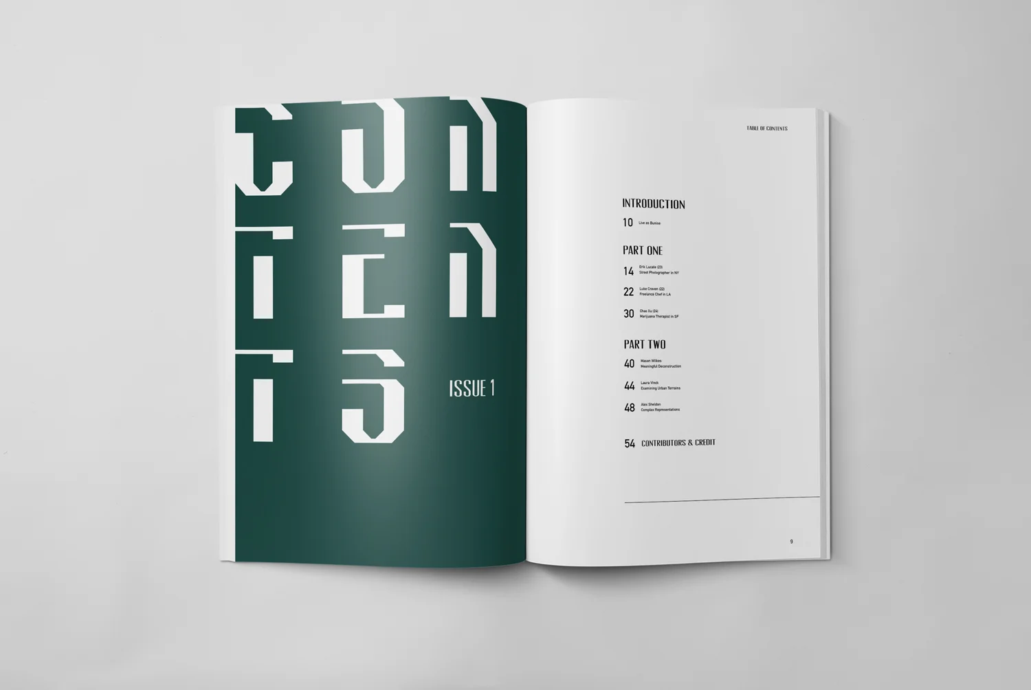
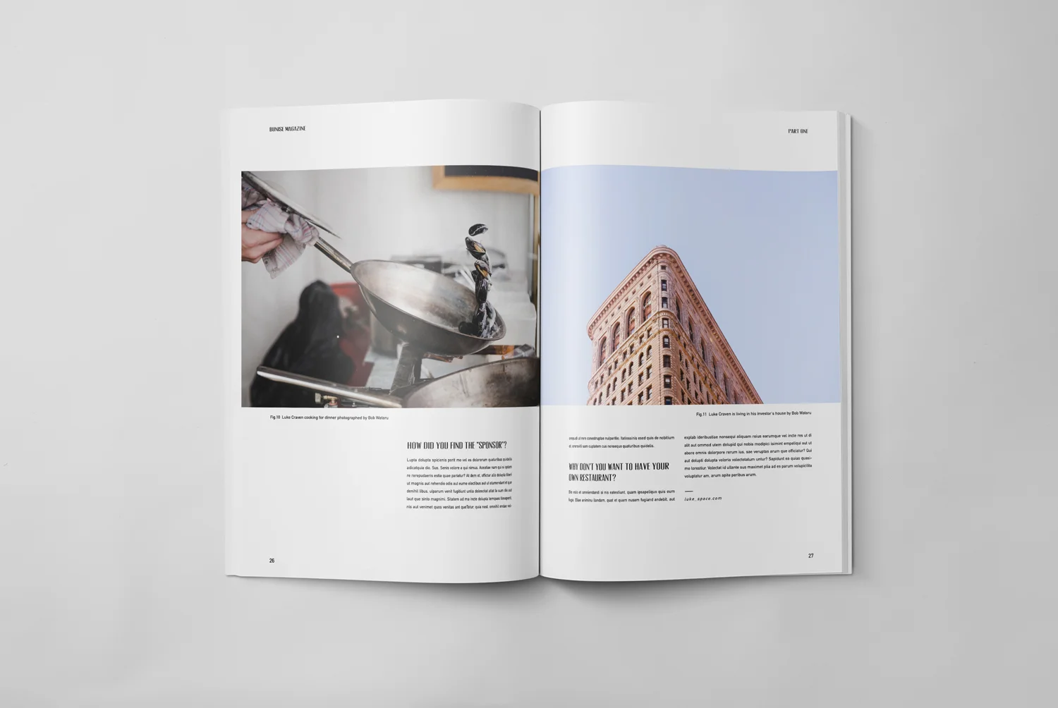
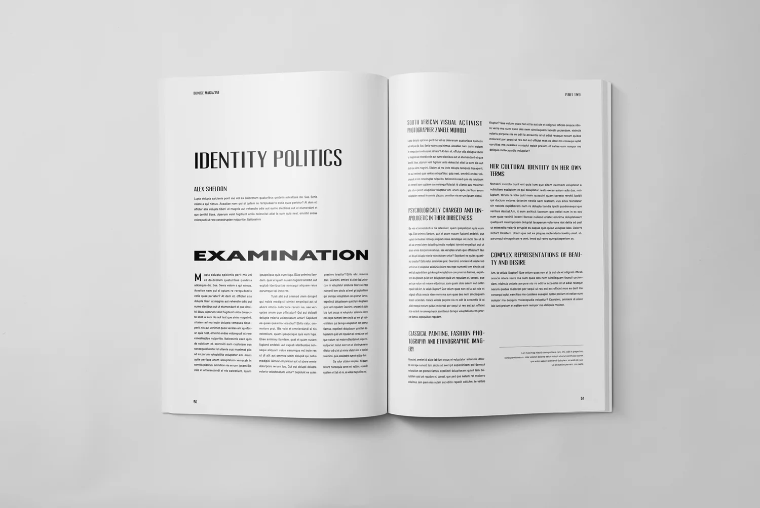
INSIDE SPREADS
Those are some of inside spreads of the magazine.
Mainly, there are two sections for the contents.
PART ONE
Interviews of inspiring millennials
PART TWO
Three art related articles.


