DAY FOR NIGHT
Packaging design for Peruvian Chocolatier, Death by Xoko.

DAY FOR NIGHT
This project is a redesign of the logo for Day For Night, a music and art festival in Houston, Texas.
The concept of the festival is a fusion of electronic music and digital art.
It's been going since 2015 and their target audience is young folks who love both music and art.
I tried to make the current logo represent that concept more effectively and be more attractive for the target audience.
PROBLEM
The current logo is very simple and well designed, but not as edgy as the festival actually is.
The festival is full of digital art and light displays, but the current logo doesn't communicate any of that.
Day For Night | website
SKETCHES
I started with making rough sketches in my notebook.
I set three adjectives as the theme for the logo;
edgy
futuristic
geometric
DEVELOPMENT
After sketching ideas, I decided to choose the one that looked like a neon sign,
because I thought it would best communicate the fusion of electronic music and digital art.
I kept improving the legibility of the festival name, and tried to make it as symbolic as possible.
Finally, I applied the circle around the logotype.
I divided the circle to indicate the two major contents,
"Electronic Music" and "Digital Art", and also to represent the shift from daytime to night time.

FINAL OUTCOME
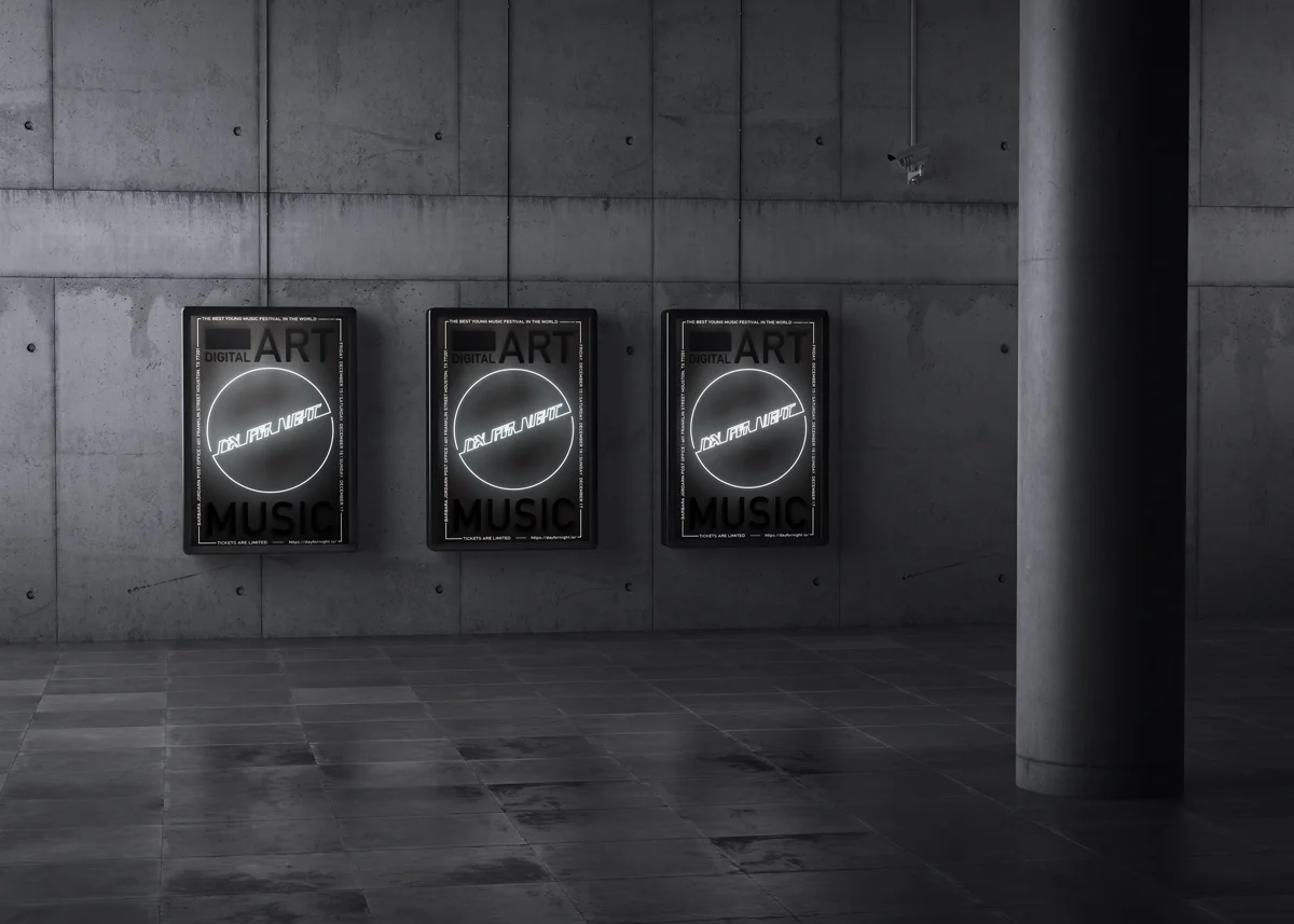
I inverted the color and added the effect "outside glow" to make it look like a neon sign.
I made a color variation as well; white for the main color, blue and red for the alternate colors.


