MANO

MANO
MANO is a mezcal brand which is targeting millennials in the US. Mezcal is well known as one of the traditional spirits in Mexico. Even though mezcal is getting more popular among young folks in the US lately, most of the existing brands are very classic and we hardly see modern and stylish mezcal brands in the market. So, this project started with the aim of creating new and young fans of mezcal bringing a different vibe into the market. “Mano”, the name of the brand, is a Spanish word meaning “hand“ originally. But, it is also a term that is being used when you call somebody very close to you; you can think it as “bro(ther)“ or “baddy“ in English.
SOCIAL STATEMENT
The goal was not simply making a cool product. We wanted to communicate some social messages by producing the product as we have been seeing conflicts increasing between the US and Mexico since the current US president got elected. That was quite a historical moment in a negative way. The new leader has uncovered lots of hate unnecessarily, and racism has been escalated over the country. But, we have to be aware of the fact that all human beings are equally beautiful.
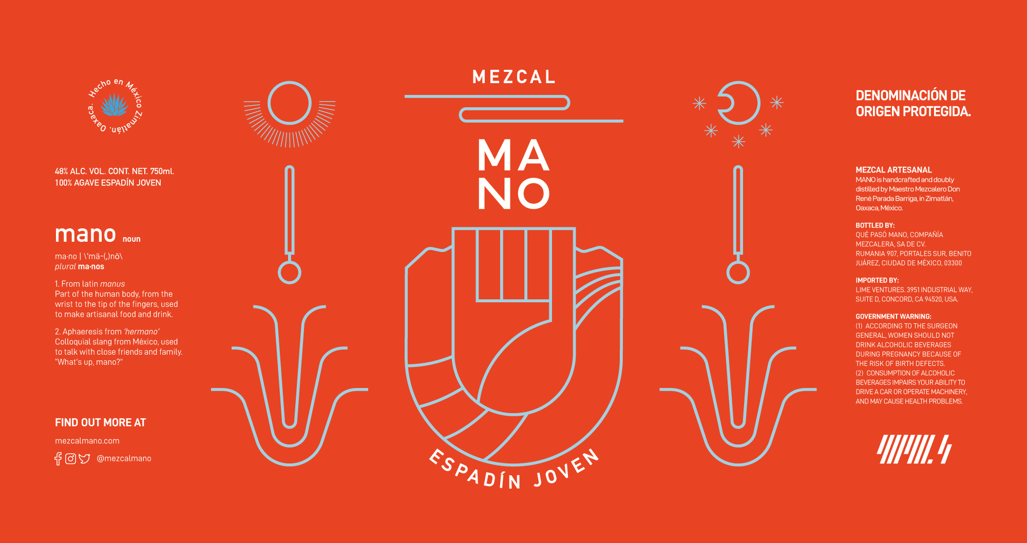
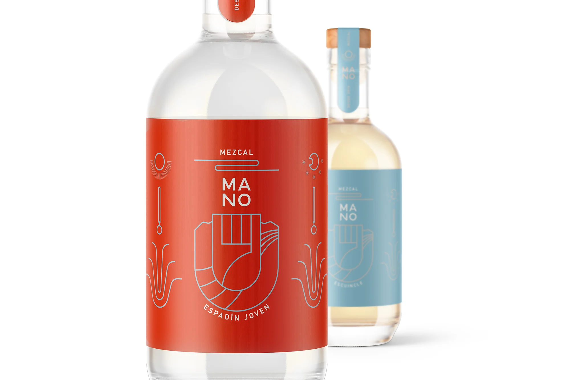
Having the strong belief, I wanted to use a strong color that represents the pride of Mexicans. There were lots of discussions, but eventually we decided to go with the red, because I was very much inspired by some locals saying mezcal is “Blood of the Earth.“ Another color, turquoise blue, represents the rich water in Zimatlán, which is the place where the mezcal is produced. When you have a closer look at the illustration, you can see the story behind the production; MANO is made by a combination of producer’s hard work and the blessings of the nature in Mexico. We proudly introduce this sophisticated mezcal product to you. Please enjoy every single sip. You will see the beauty in it.
LABLES AND CAPS


ILLUSTRATION IDEAS


