SEPTEMBER
A typeface designed for use in any kinds of artistic arenas.
SEPTEMBER
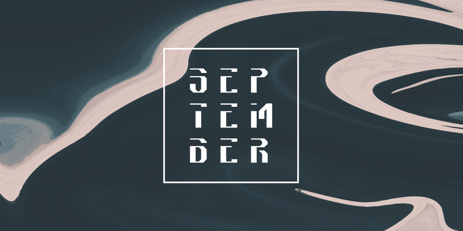
SEPTEMBER is a typeface that I invented.
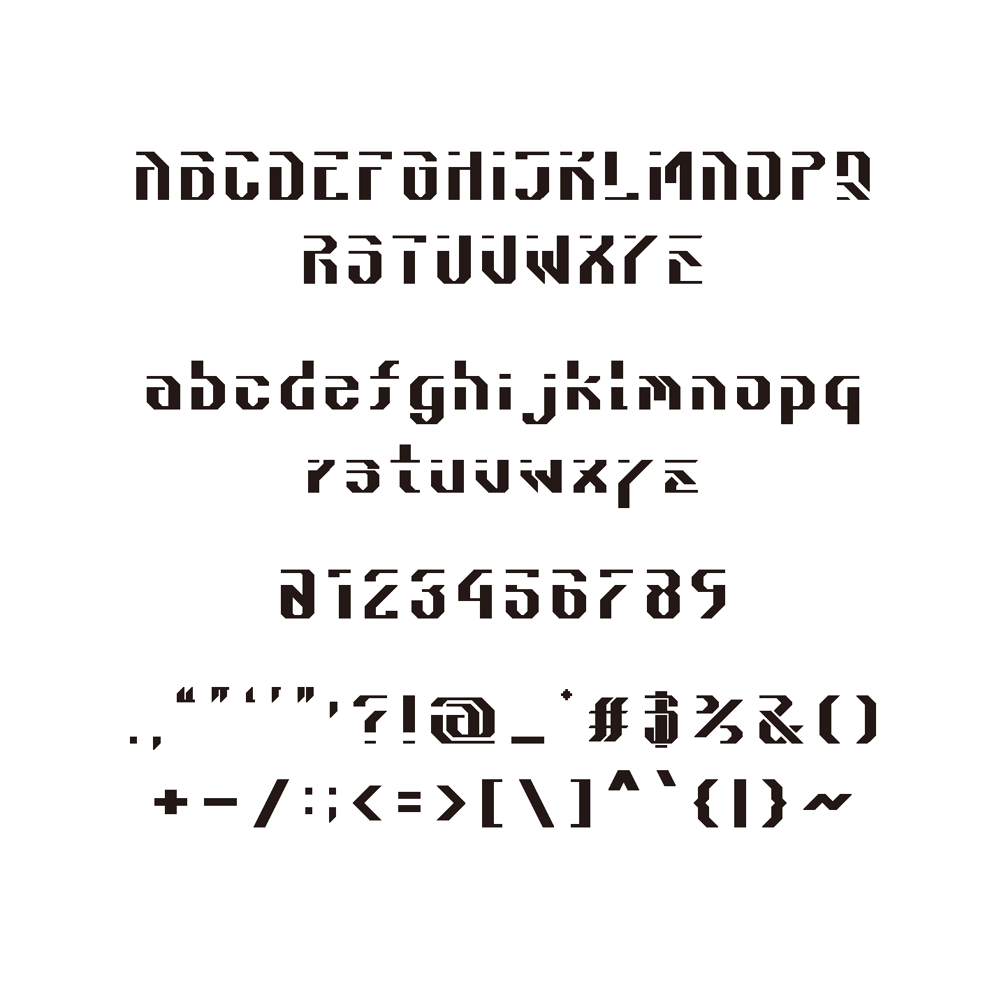
The unique characteristics of this typeface come from the use of negative spaces where regular letters connect.
The blank space is consistently on the upper left part of the letters, giving it a modern and urban personality.
I developed it in an attempt to transform a Japanese traditional font, Mincho, into Roman letters.
The idea is seen in the consistency of its geometric form and use of thin horizontal lines and thick vertical lines.
DEVELOPMENT
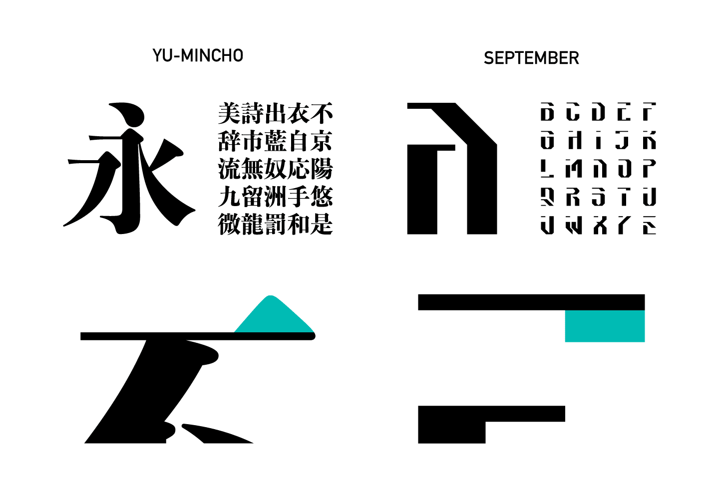
As you can see, Yu Mincho, one of the most common mincho typefaces,
has thick vertical lines and thin horizontal lines in each characters, which is one of the same features of SEPTEMBER.
Also, some of SEPTEMBER's characters ,like "E" and "F", have beaks, and that was inspired by the beak-ish terminals of Mincho typefaces.
SAMPLES
Since it has such unique and strong features,
it is expected to be used for signboards or logos rather than reading texts such as articles.
It fits in perfectly when it is used in fashion, music, movies or any other kinds of artistic arenas.

POSTER FOR AN ART EVENT
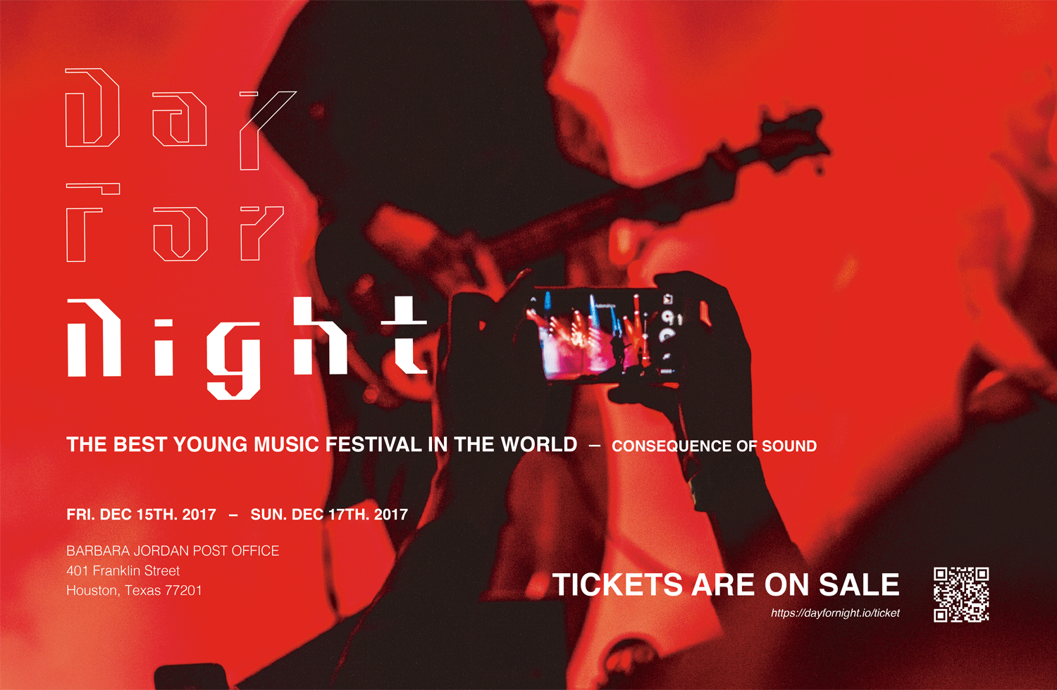
POSTER FOR A MUSIC FESTIVAL

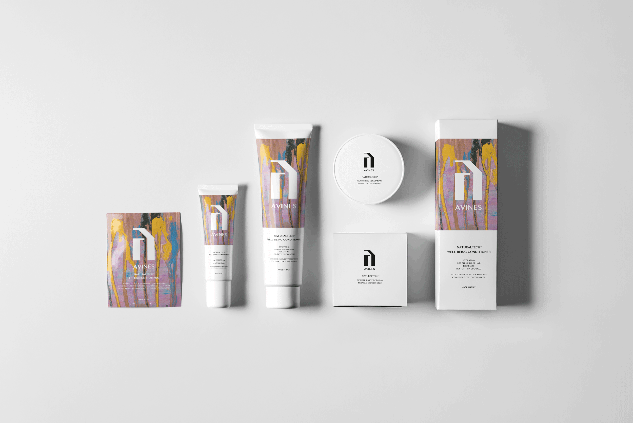
A LOGO FOR A COSMETIC BRAND
